
Browse by Stream
-
Engineering and Architecture
Exams
Colleges
Predictors
Resources
-
Computer Application and IT
Quick Links
Colleges
-
Pharmacy
Colleges
Resources
-
Hospitality and Tourism
Colleges
Resources
Diploma Colleges
-
Competition
Other Exams
Resources
-
School
Exams
Top Schools
Products & Resources
-
Study Abroad
Top Countries
Resources
-
Arts, Commerce & Sciences
Colleges
Upcoming Events
Resources
-
Management and Business Administration
Exams
Colleges & Courses
Predictors
-
Learn
Law Preparation
MBA Preparation
Engineering Preparation
Medical Preparation
-
Online Courses and Certifications
Top Streams
Specializations
- Digital Marketing Certification Courses
- Cyber Security Certification Courses
- Artificial Intelligence Certification Courses
- Business Analytics Certification Courses
- Data Science Certification Courses
- Cloud Computing Certification Courses
- Machine Learning Certification Courses
- View All Certification Courses
Resources
-
Medicine and Allied Sciences
Colleges
Predictors
Resources
-
Law
Resources
Colleges
-
Animation and Design
Exams
Predictors & Articles
Colleges
Resources
-
Media, Mass Communication and Journalism
Colleges
Resources
-
Finance & Accounts
Top Courses & Careers
Colleges
Get Answers to all your Questions


- 1.0
- 1.0
- 1.0
- 1.0
- 1.0
- 2.0
- 2.0
- 2.0
- 2.0
- 3.0
- 3.0
- 3.0
- 3.0
- 3.0
- 4.0
- 4.0
- 4.0
- 4.0
- 5.0
- 5.0
- 5.0
- 5.0
- 6.0
- 6.0
- 6.0
- 6.0
- 7.0
- 7.0
- 7.0
- 7.0
- 8.0
- 8.0
- 8.0
- 8.0
- 9.0
- 9.0
- 9.0
- 9.0
- 10.0
- 10.0
- 10.0
- 10.0
- 11.0
- 11.0
- 11.0
- 12.0
- 12.0
- 12.0
- 13.0
- 13.0
- 14.0
- 14.0
- 15.0
- 15.0
- 16.0
- 16.0
- 17.0
- 17.0
- 18.0
- 18.0
- 19.0
- 19.0
- 20.0
- 20.0
- 21.0
- 22.0
- 23.0
- 24.0
- 25.0
- 26.0
- 27.0
- 28.0
- 29.0
- 30.0
The frequency distribution :
| Marks | 0-20 | 20-40 | 40-60 | 60-100 |
| Number of Students | 10 | 15 | 20 | 25 |
has been represented graphically as follows :
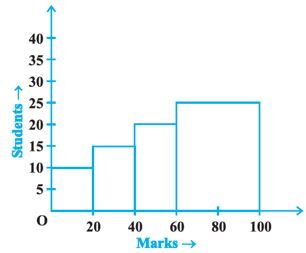
Do you think this representation is correct? Why?
Answers (1)
Given :
| Marks | 0-20 | 20-40 | 40-60 | 60-100 |
| Number of Students | 10 | 15 | 20 | 25 |
| Class interval (x-axis) | Frequency (y-axis) |
| 0-20 | 10 |
| 20-40 | 15 |
| 40-60 | 20 |
| 60-100 | 25 |
The above will be plotted as:
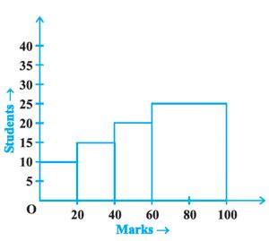
Hence, the given graph is correct.
View full answer
Similar Questions
- In a cricket match, a batswoman hits a boundary 6 times out of 30 balls she plays. Find the probability that she did not hit a boundary.
- 1500 families with 2 children were selected randomly, and the following data were recorded:Compute the probability of a family, chosen at random, having 2 girls
- 1500 families with 2 children were selected randomly, and the following data were recorded: 1 girl
